Progress so far: Still a long way to go.. Next step is to clean up the lines of the letters I’m happy with. This page will be updated throughout the month, so check back often as I continue with my 12 projects of 2012. I’d love feedback and criticism on this and any of my other up coming projects.
Progress on hold until new macbook pro’s come out ..Sorry.
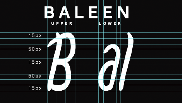
Stage three - Parts to still work on

Points highlighted in red are sections I need to work on and improve. Need to clean up nearly all the lines but nearly done setting the framework for all the other letters, so an improvement.
Stage two - Modifying the sketch

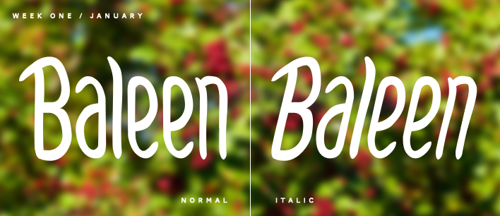
Separating the font styles and removing the serif to see how it feels.
Stage one - Sketching the first few letters
Working on the first few letters ( B, a, l, e and n) to use as a starting block. After scanning in, I’ve started cleaning it up. Baleen was originally meant to be a straight italic font but after playing with the angle, I’ve grown to like the standard style.